
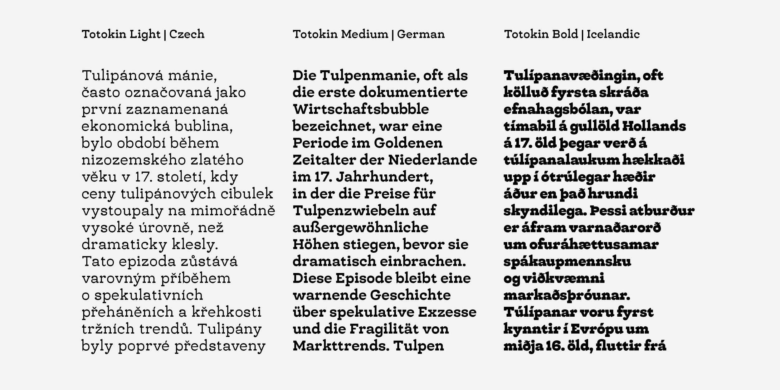

Totokin
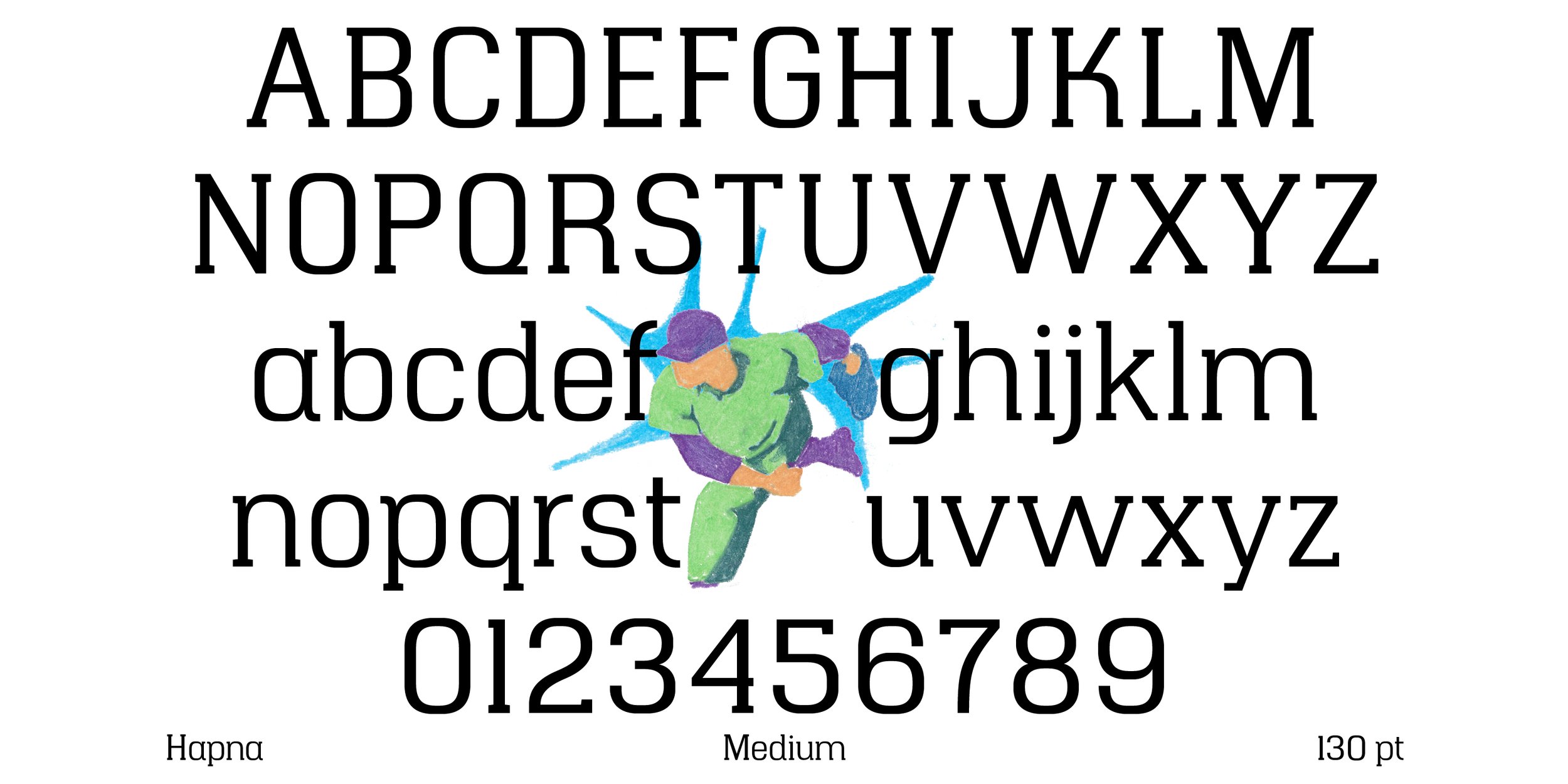
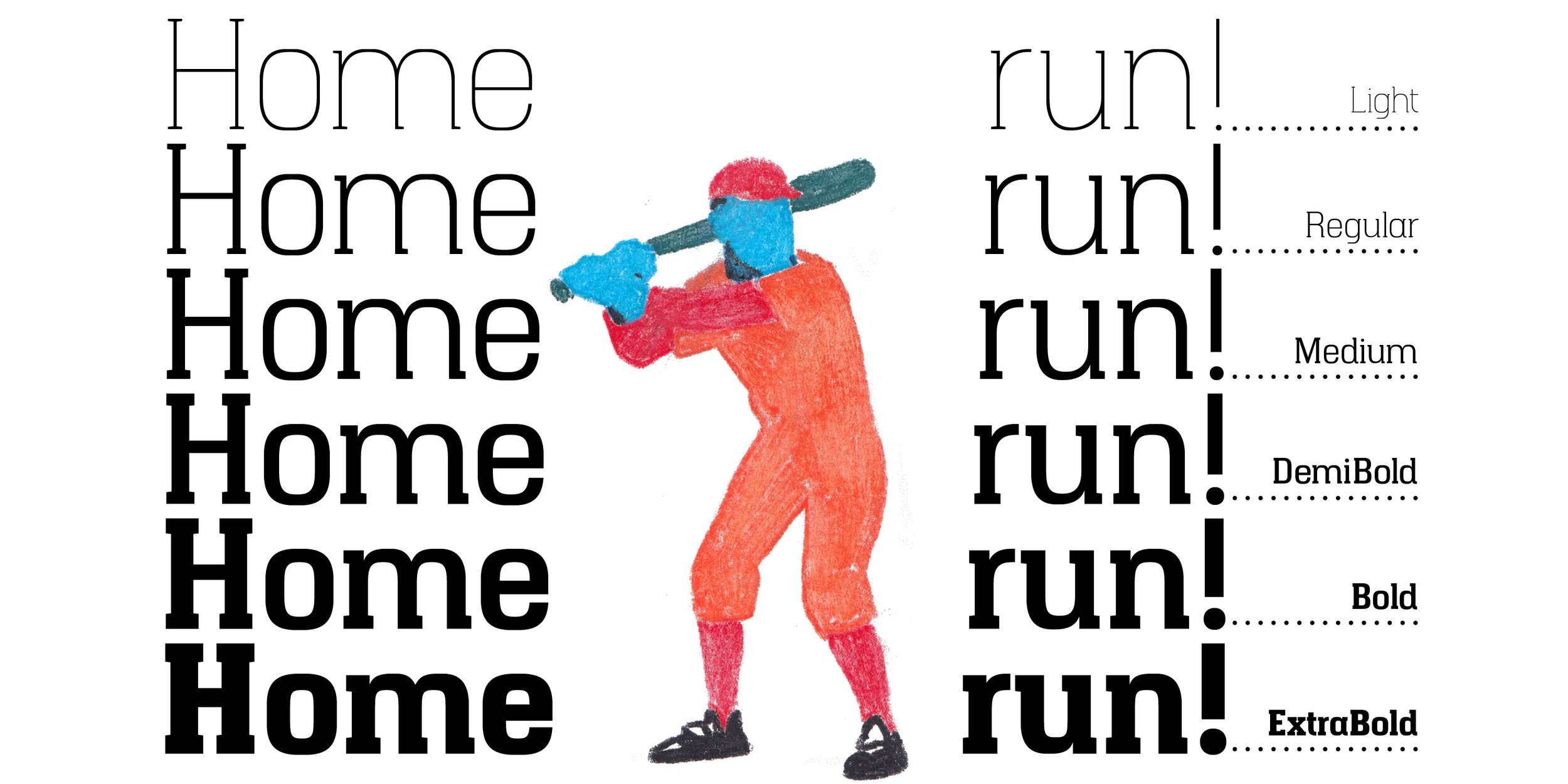
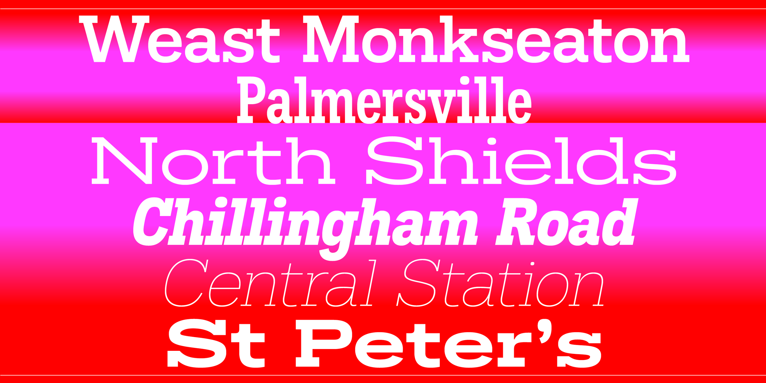
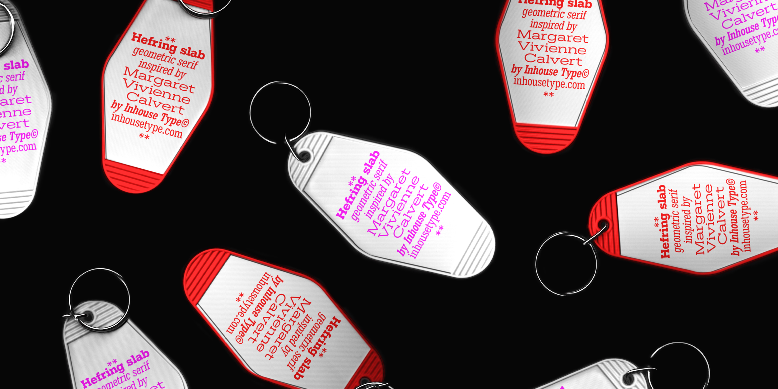
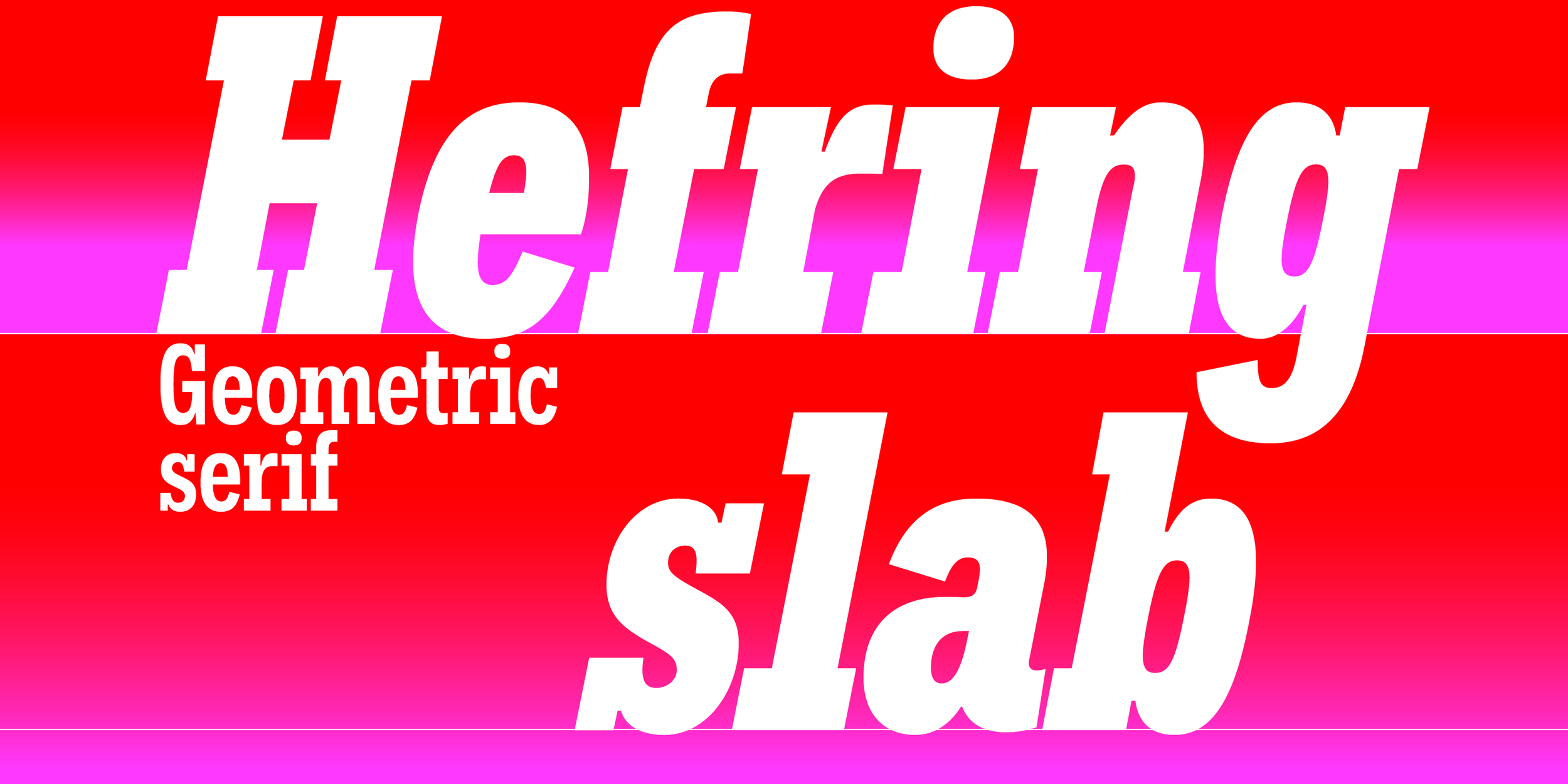
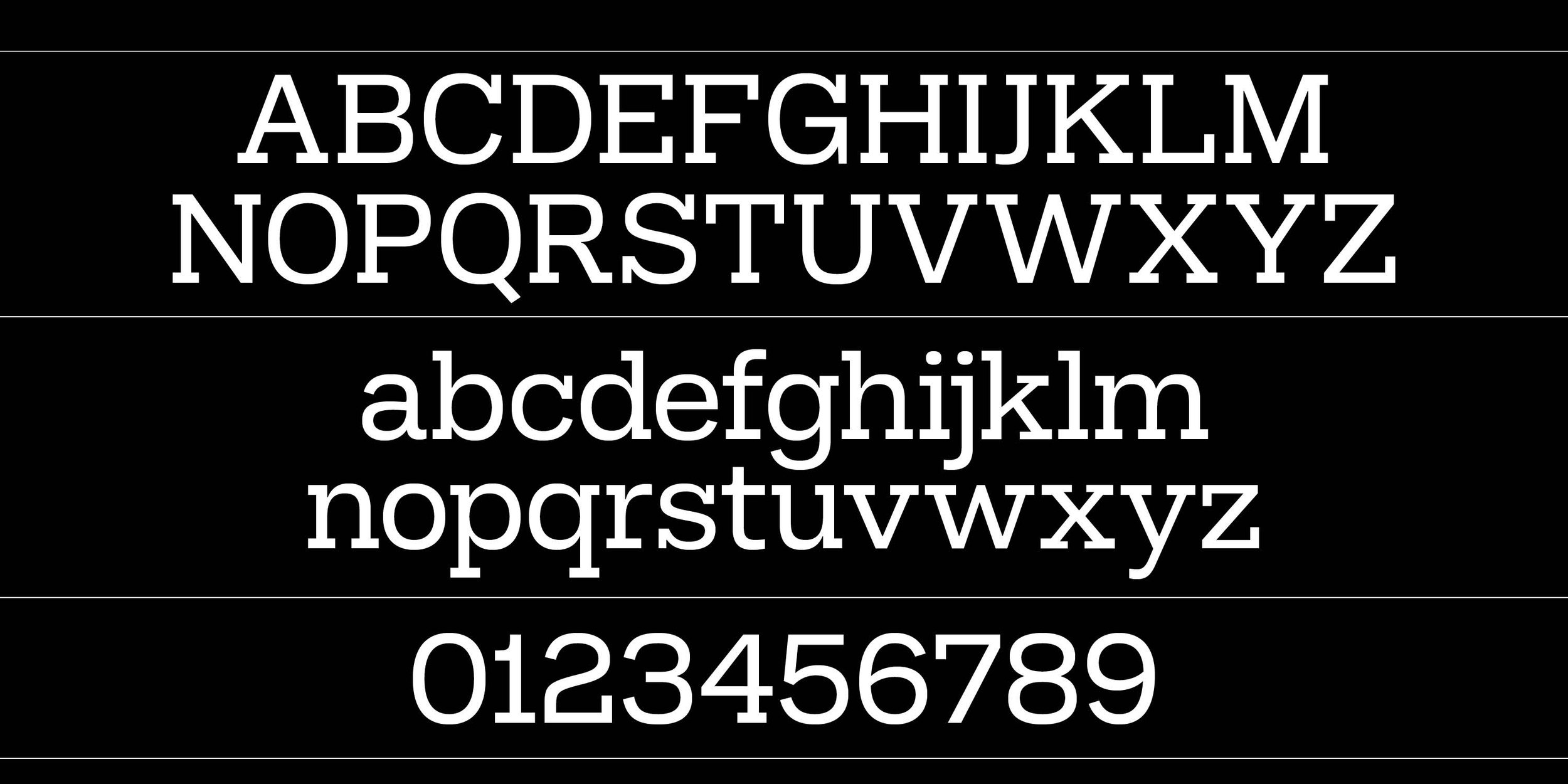
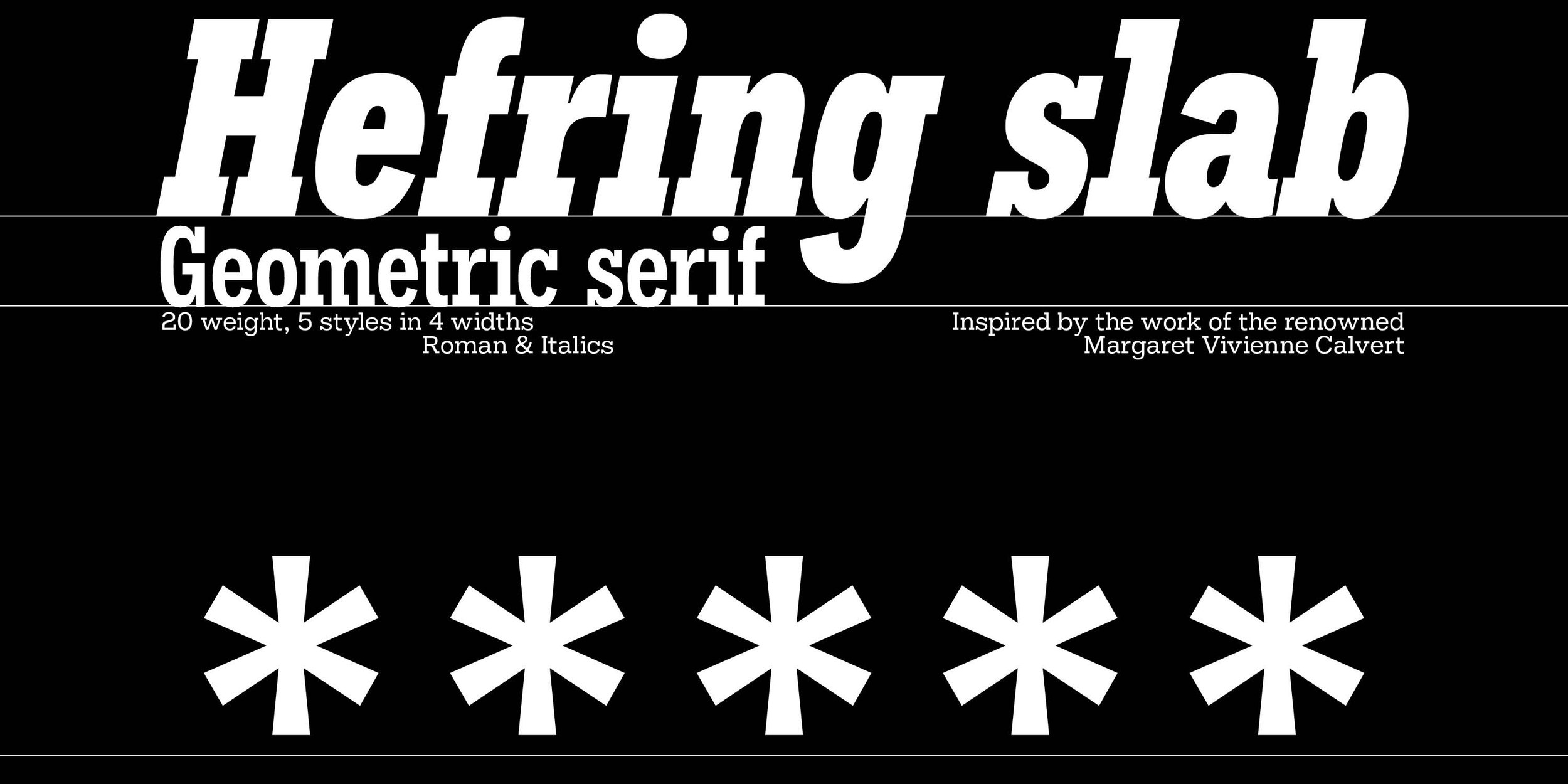
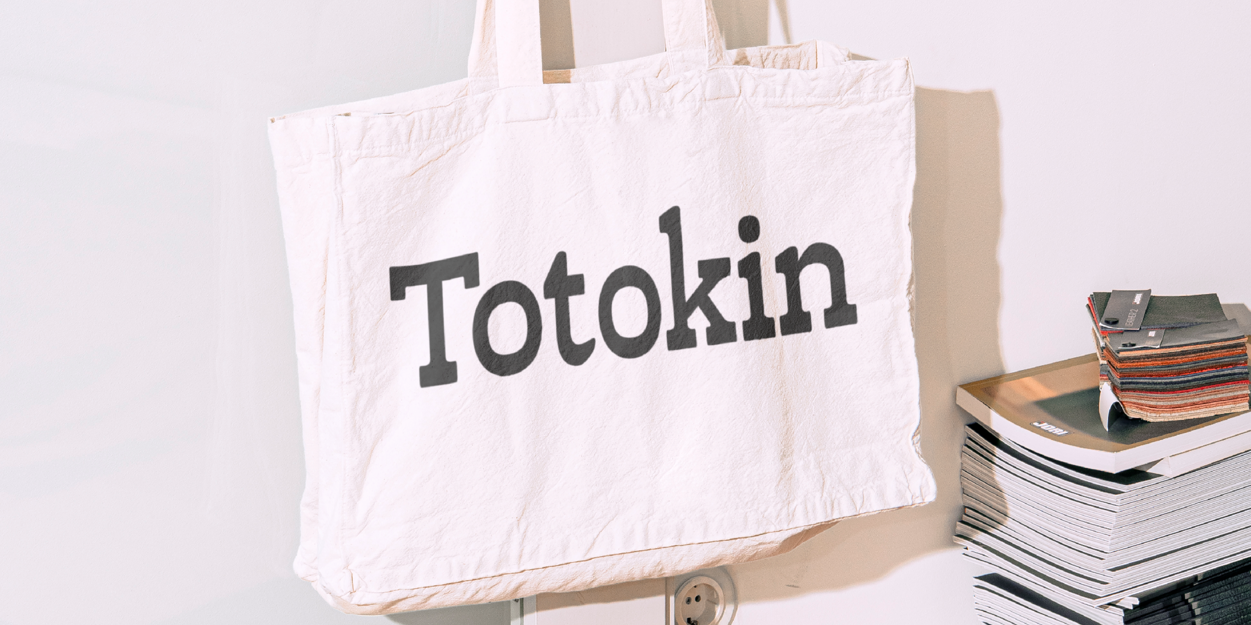
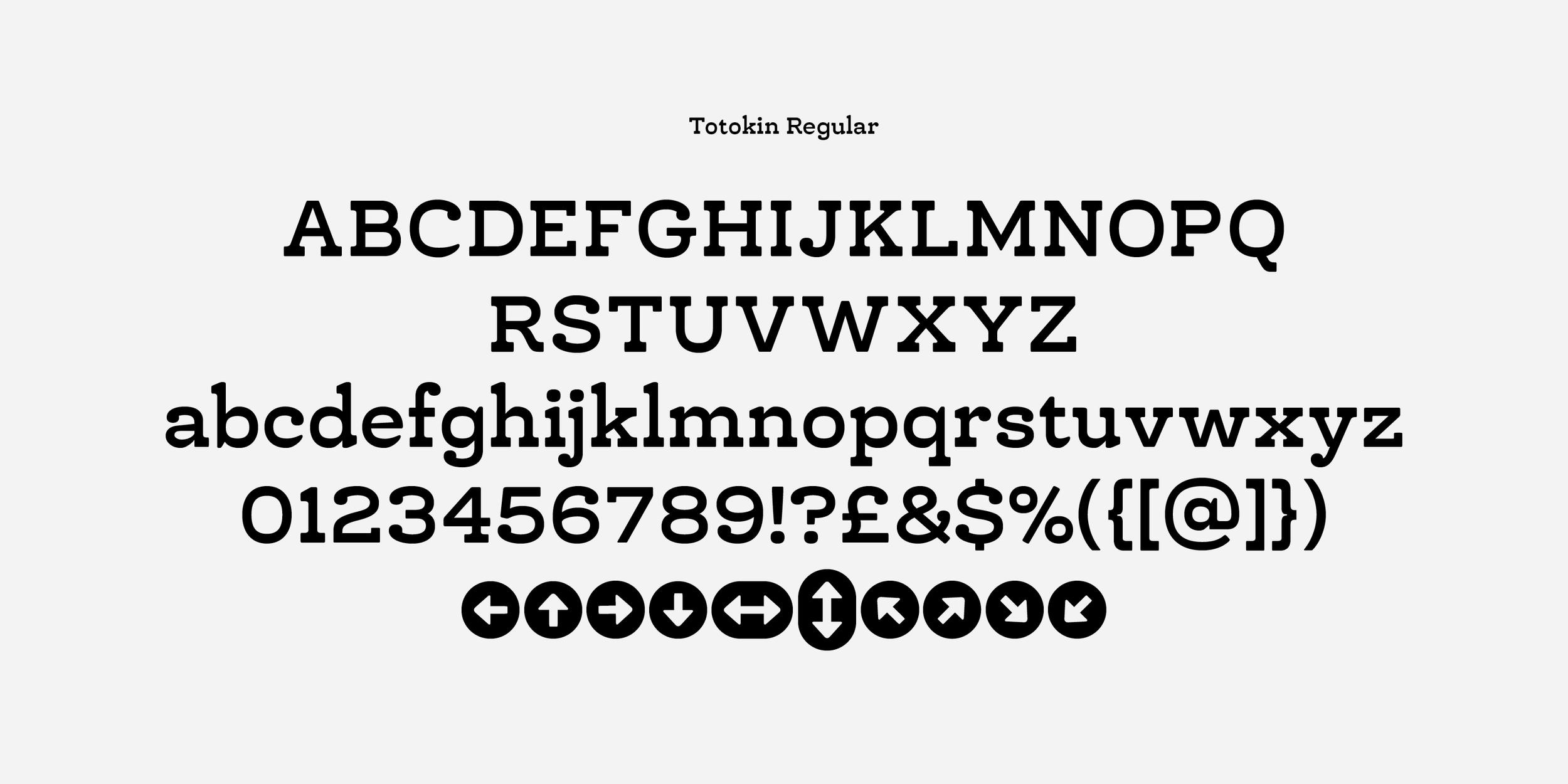
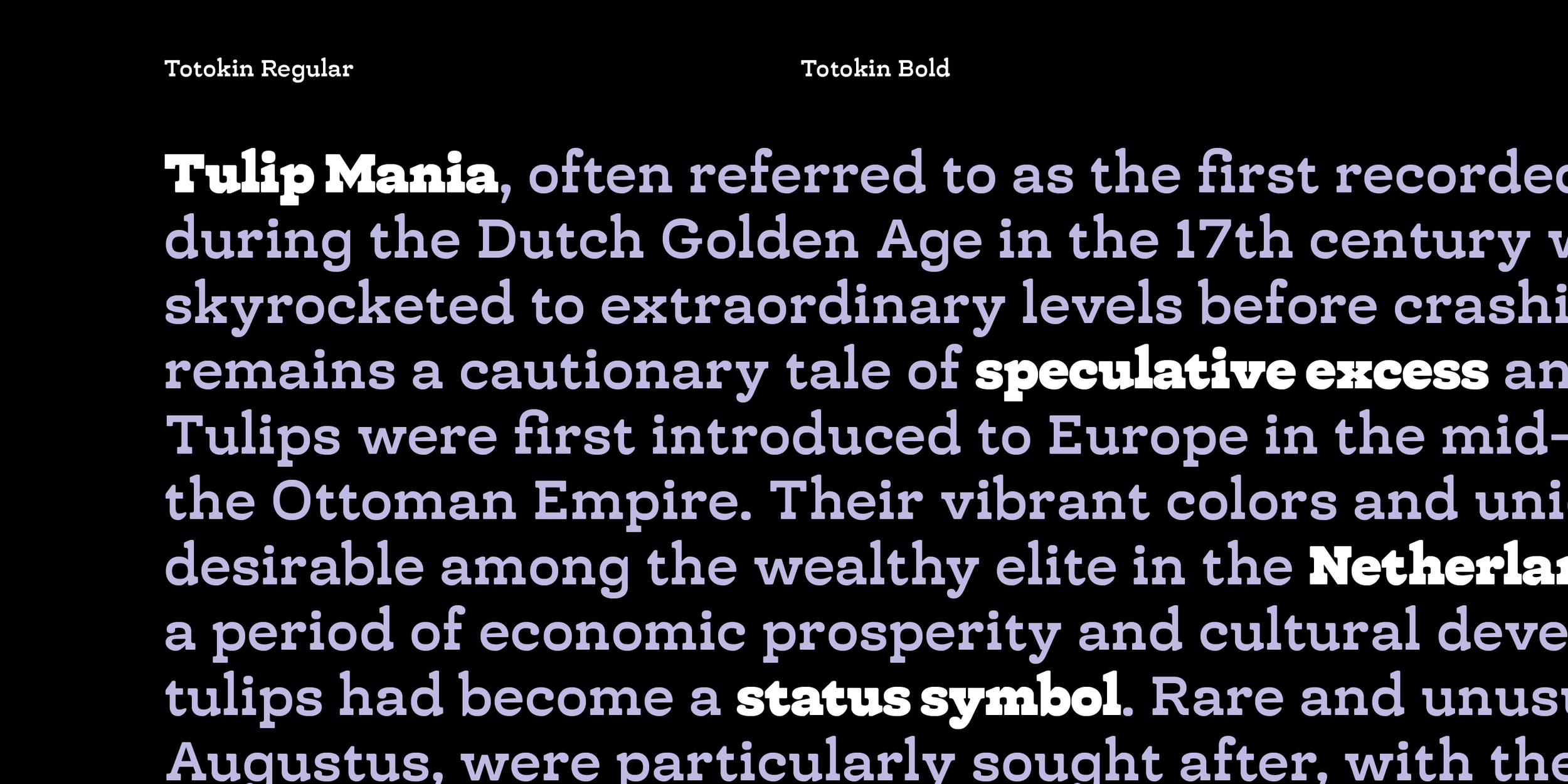
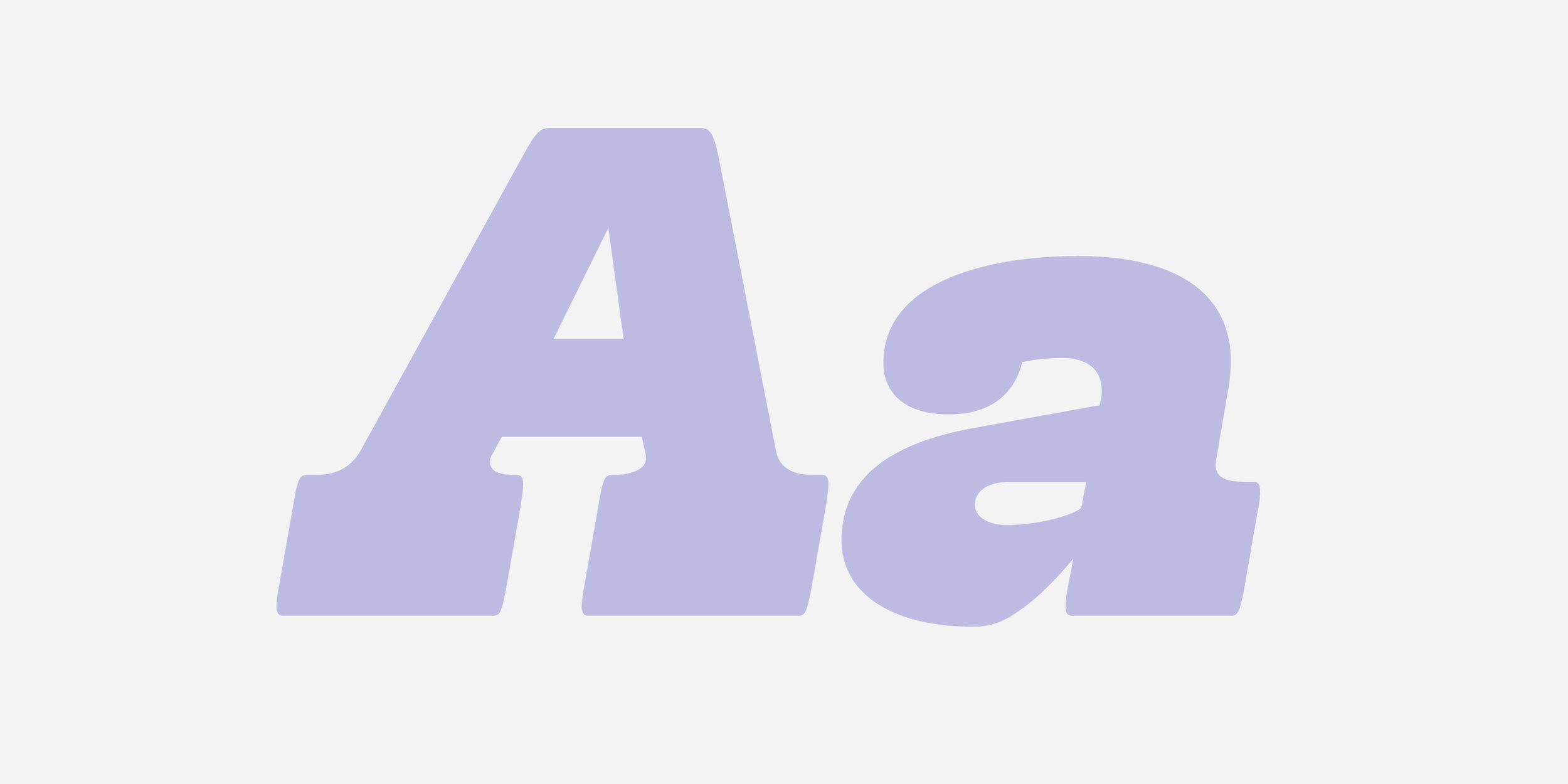
Totokin is a moderately reverse-contrast slab serif typeface, distinguished by its unique blend of soft curves, gentle forms, and sturdy structure. This defining style creates a harmonious balance between readability and visual appeal, making it a versatile choice for various design applications. The reverse-contrast feature, where horizontal strokes are thicker than vertical ones, lends Totokin a subtle but noticeable personality, setting it apart from traditional slab serif typefaces.
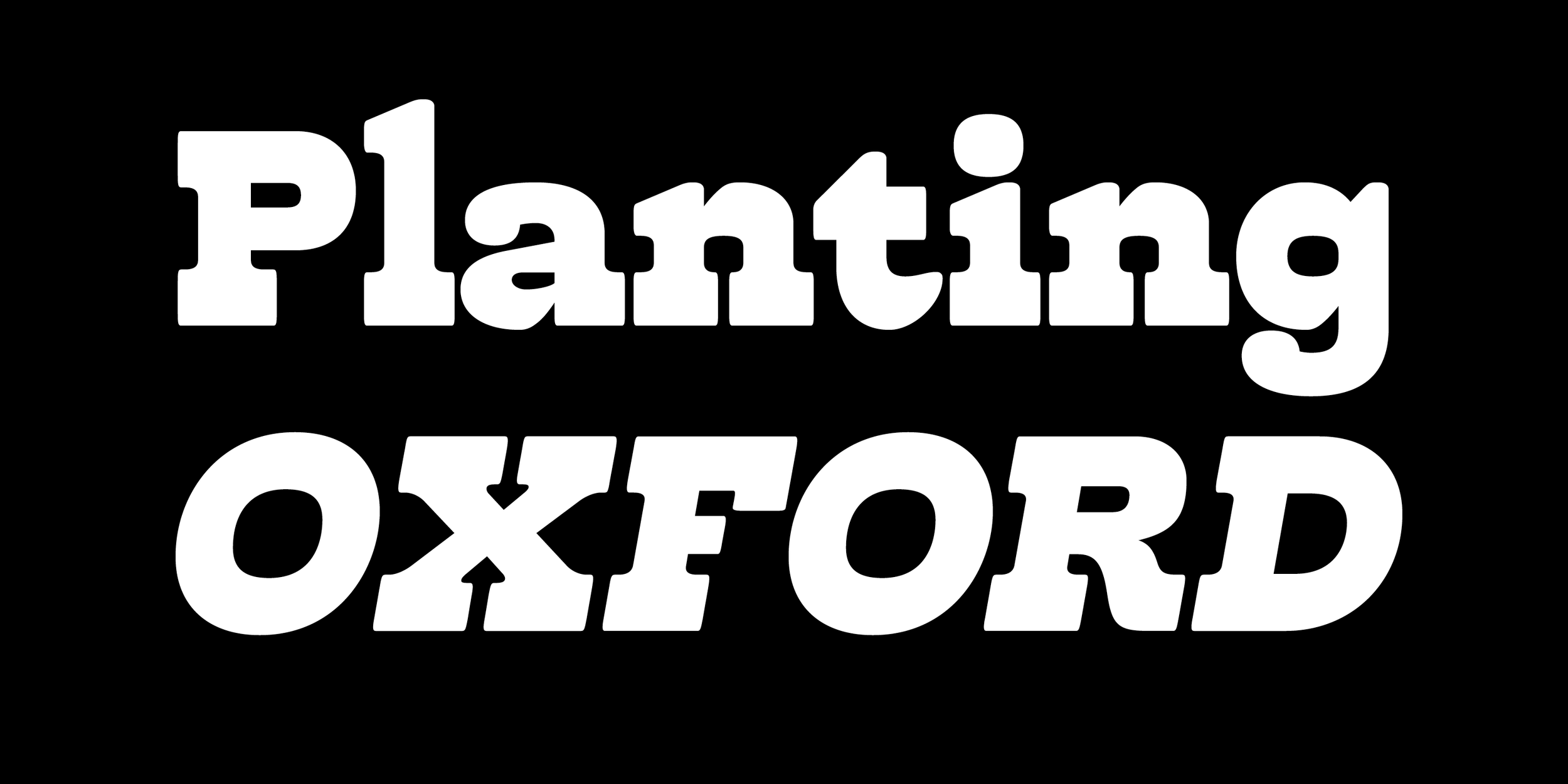
While its primary purpose is for text, Totokin’s approachable yet robust aesthetic also makes it suitable for branding, editorial design, packaging, and signage. The softness in its letterforms adds a welcoming touch, while its solid construction ensures legibility and impact, even at smaller sizes.
Format: OTF.
License: Desktop License (1 User).
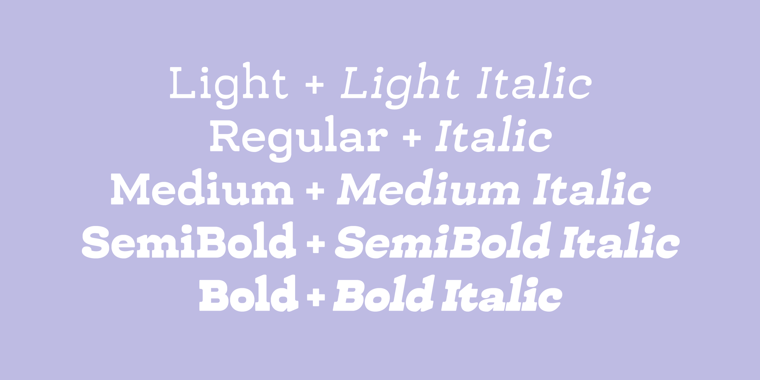
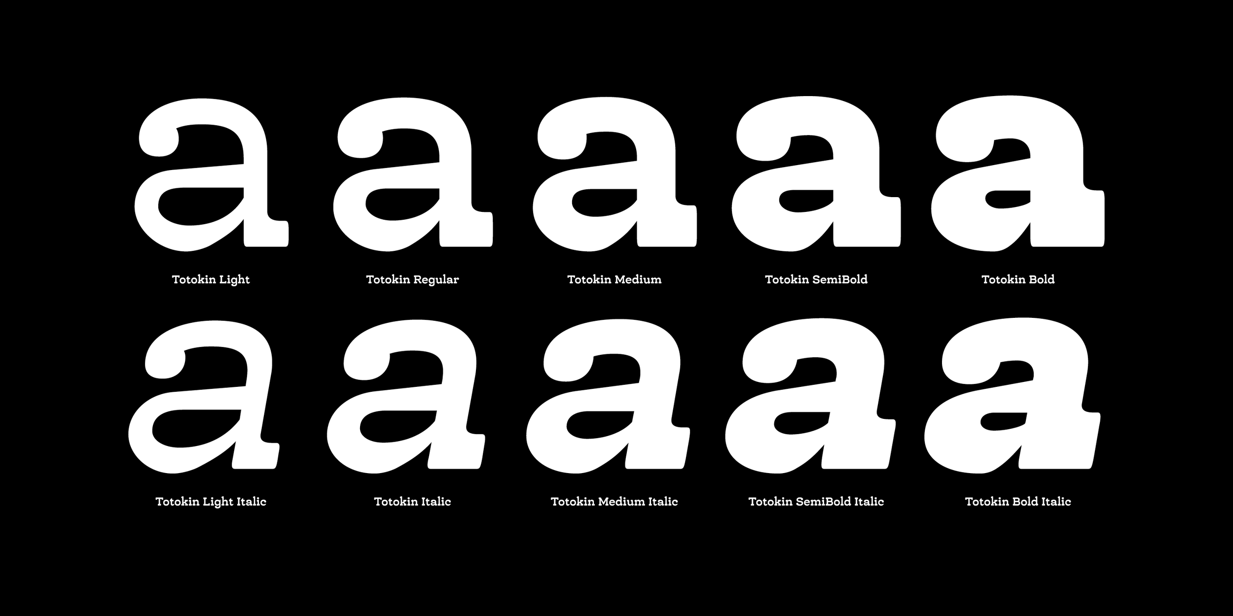
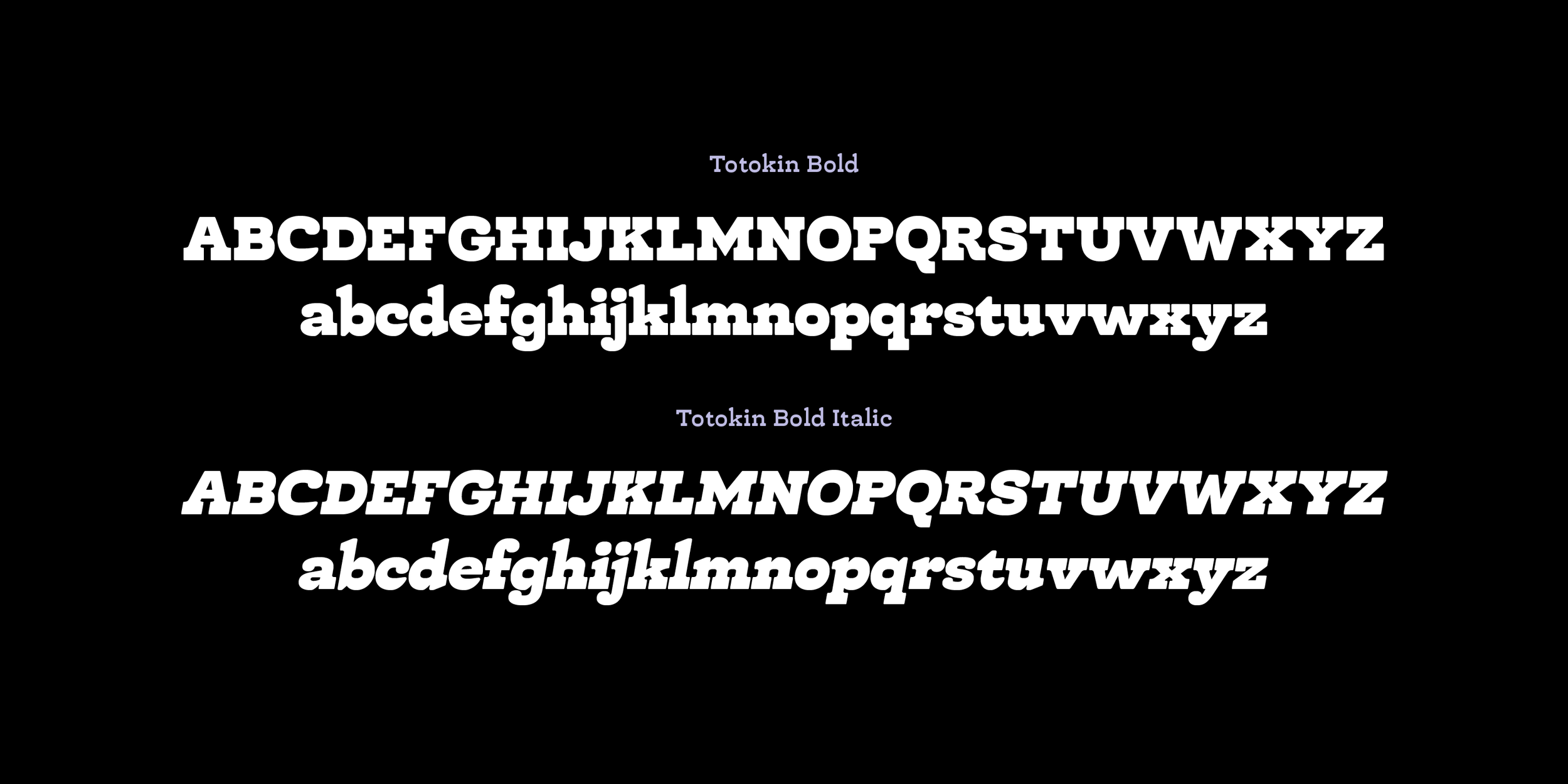
Styles: Light, Light Italic, Regular, Italic, Medium, Medium Italic, SemiBold, SemiBold Italic, Bold, Bold Italic.
Totokin is a moderately reverse-contrast slab serif typeface, distinguished by its unique blend of soft curves, gentle forms, and sturdy structure. This defining style creates a harmonious balance between readability and visual appeal, making it a versatile choice for various design applications. The reverse-contrast feature, where horizontal strokes are thicker than vertical ones, lends Totokin a subtle but noticeable personality, setting it apart from traditional slab serif typefaces.
While its primary purpose is for text, Totokin’s approachable yet robust aesthetic also makes it suitable for branding, editorial design, packaging, and signage. The softness in its letterforms adds a welcoming touch, while its solid construction ensures legibility and impact, even at smaller sizes.
Format: OTF.
License: Desktop License (1 User).
Styles: Light, Light Italic, Regular, Italic, Medium, Medium Italic, SemiBold, SemiBold Italic, Bold, Bold Italic.
If you are looking to acquire a single font style, custom licence or desktop licence for multiple users, web, application, social media, logotype, video licence etc., please email contact@inhousetype.com